A bill-pay portal refresh, built for the 30–50 financial institutions that run on it.
Bill-Pay SSO is the portal a financial institution's customers single-sign-on into to pay bills, recharge, and more (whitelabelled per client, live across 30–50 partner organizations). This was a UI/UX enhancement of that experience, paired with a set of micro-illustrations contributed to the payments fintech design system to bring the biller list to life.
One sign-on, every bill.
A customer logs into their financial institution and lands in Bill-Pay SSO without a second login, the payments fintech-powered portal, wearing the institution's brand, where they add billers, pay and recharge, and reach adjacent services like FX. It's already live across 30–50 partner organizations; this work raised the bar on how it looks and feels.
No second login
The institution's session carries straight into the portal. The customer never re-authenticates to pay a bill.
Wears the client
The same portal is themed per client, so it reads as the client's own service across all 30–50 of them.
Bills, recharge, FX
Biller payments and mobile recharge sit beside adjacent journeys like forex: one portal, many jobs.
Functional, but flat.
The portal worked and scaled, but the experience hadn't kept pace. Biller discovery was text-heavy, categories looked alike, and the screens carried little of the polish a modern financial app sets as the baseline. The job was to lift the experience without disrupting a flow tens of enterprises depend on.
- Biller discovery was a wall of text: categories and billers hard to scan at a glance.
- No visual system for categories: nothing to make electricity, water, or broadband instantly recognisable.
- Inconsistent surfaces: forms, lists, and detail screens didn't feel like one product.
- Live across 30–50 partner organizations, so any change had to be an enhancement, not a rebuild.
Click to zoom
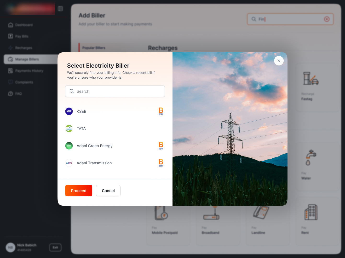
The enhanced picker puts search and recents up front. Category illustrations give the list shape and warmth.
What the enhancement set out to do.
Make bills scannable
Search, recents, and recognisable categories so finding a biller takes a glance, not a read.
Bring it to life
A coherent illustration system that adds warmth without adding noise.
One consistent surface
Lists, forms, and detail screens that read as a single, modern product across every client.
Adding a biller
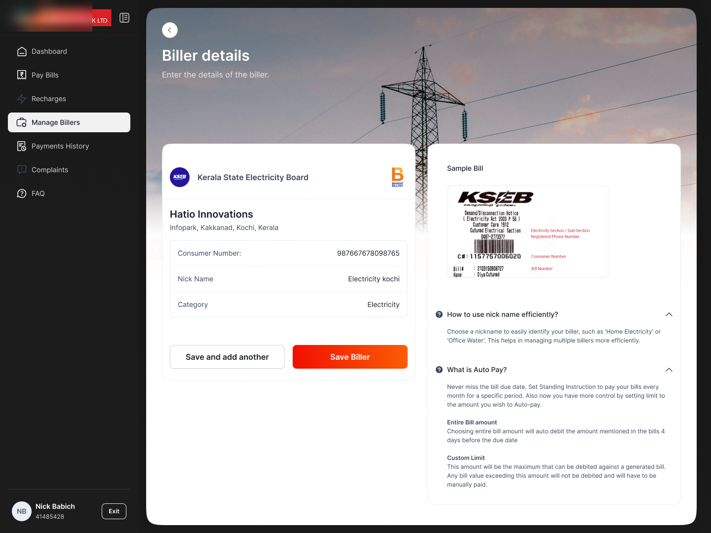
The core bill-pay job. The picker leads with search and recent billers, and uses the category illustrations to make the list legible; the biller-details screen pairs the form with a sample bill and inline help, so people enter the right number the first time.
Find the biller fast.
A focused modal: search at the top, recent and popular billers below, and the whole thing set against the category illustrations so the customer always knows which category they're in. Proceed is the single primary action.
Click to zoom
Enter the right number, once.
The detail screen does the un-glamorous work well: the biller form on the left, a labelled sample bill on the right showing exactly where the consumer number lives, and inline help ("How to find your number"): the difference between a clean add and a failed one.
 Click to zoom
Recharges
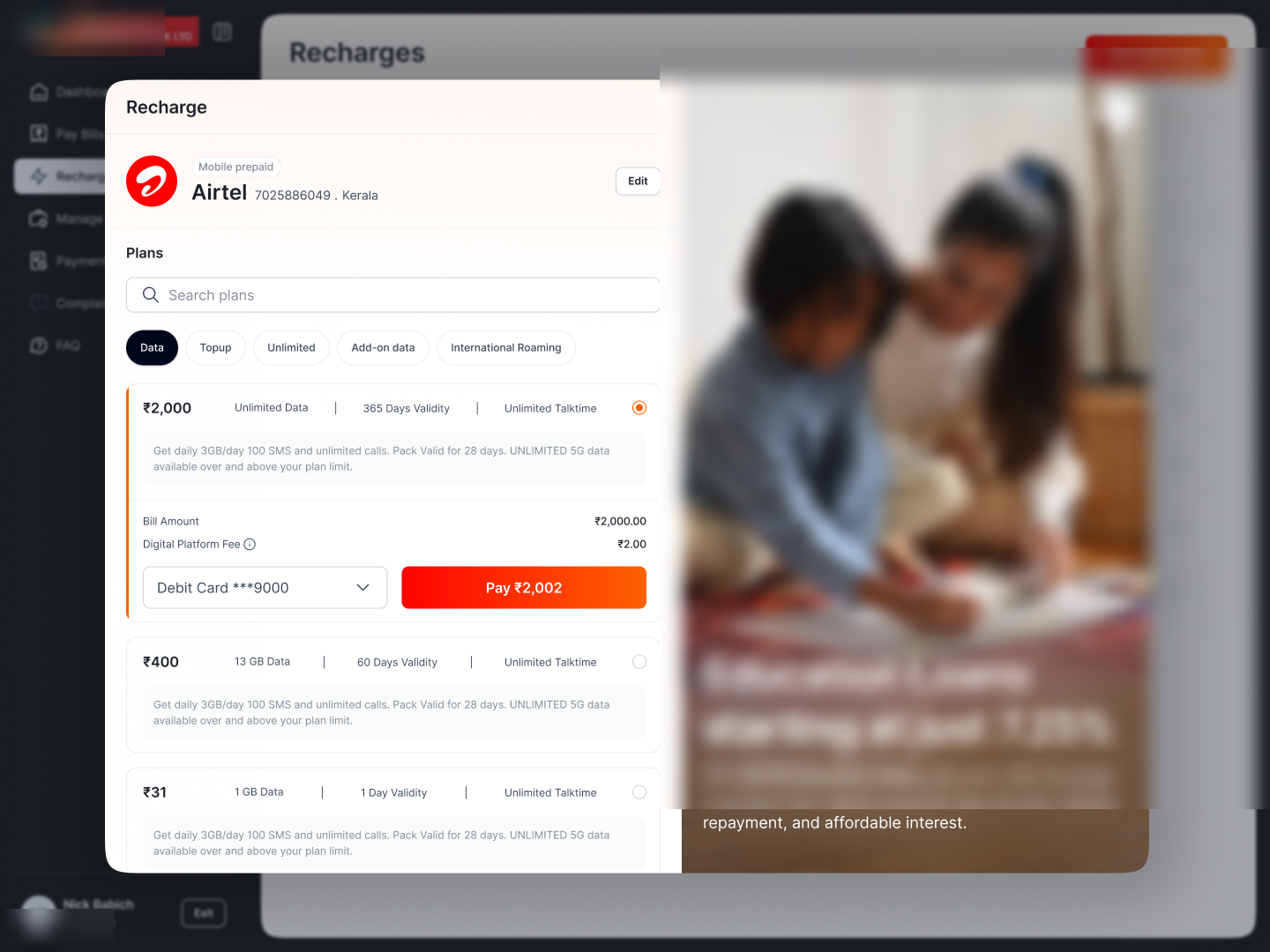
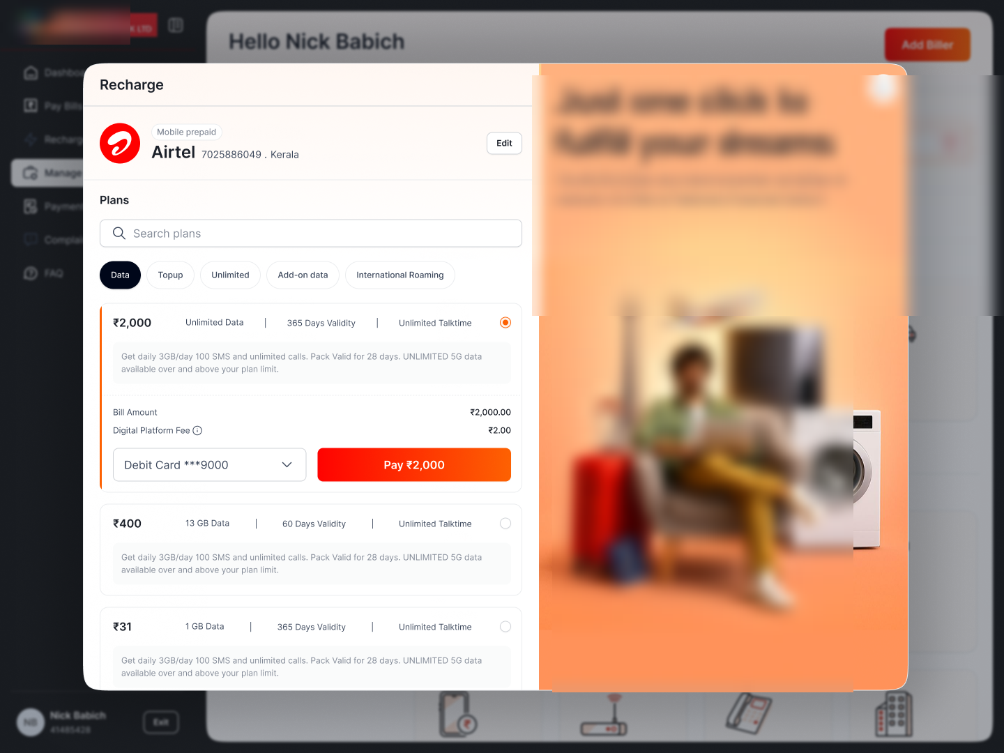
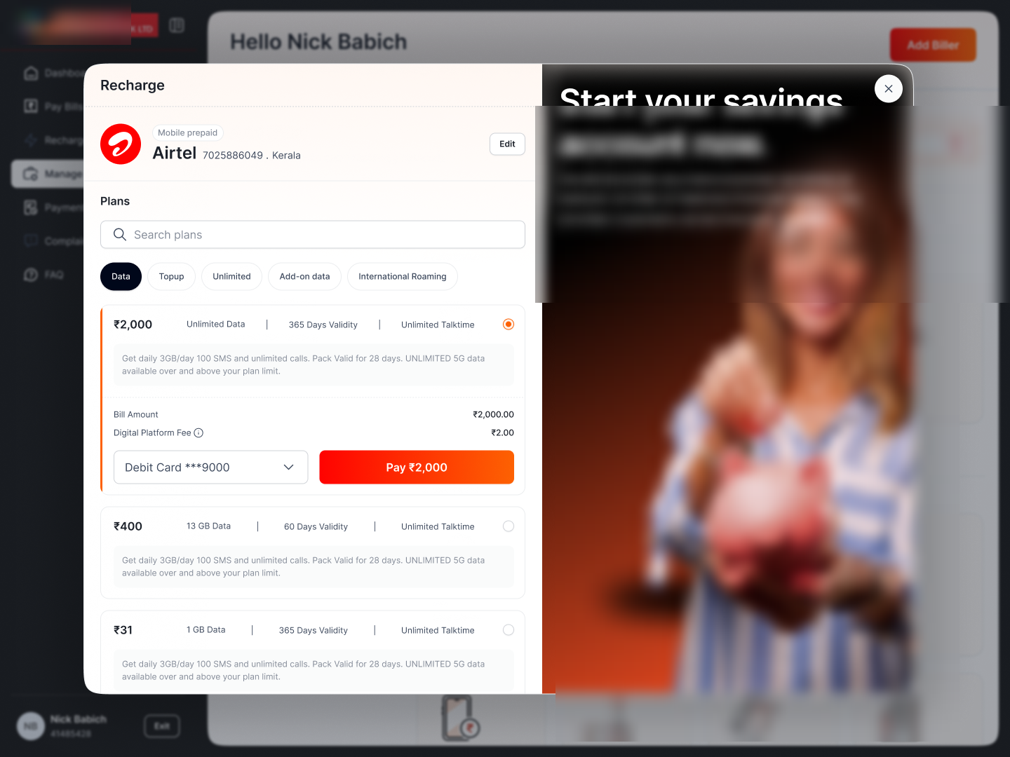
Mobile recharge as a clean plan picker: operator and number up top, plans grouped by type (top-up, unlimited, data), and the price-to-pay always in reach. Contextual banners use the space beside it to surface relevant client offers without crowding the task.
Plans you can actually compare.
The selected operator sits at the top; plans are listed with price, validity, and benefits so they're scannable side by side; the pay action carries the amount. A promo rail beside the picker shows partner offers (present, not pushy).
 Click to zoom
 Click to zoom
The banner slot adapts (here, the client's ATM network) using otherwise-empty space beside the picker.
 Click to zoom
Same layout, a different client offer: the portal cross-sells the client's products in context.
FX Retail
Proof the portal reaches beyond bills: opening and managing a retail forex account, in the same design language. A guided create-account form, then an order-history view to track and manage forex orders. Adjacent financial journeys, one consistent surface.
Forex, in the same system.
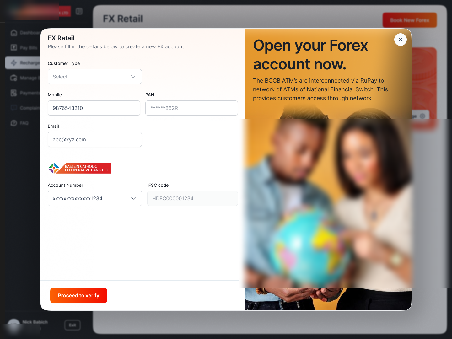
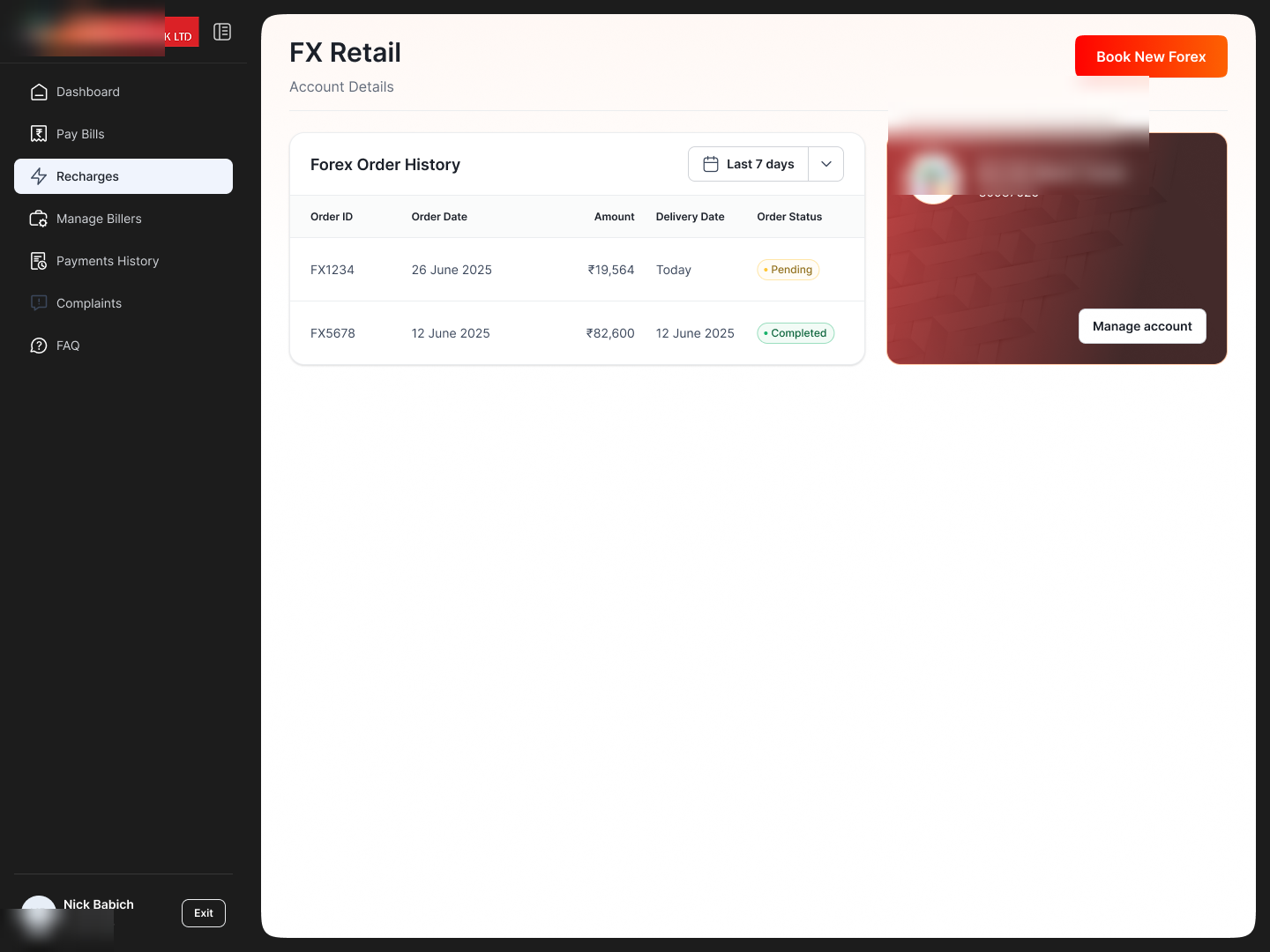
Creating an FX account uses the same form patterns as the rest of the portal (clear fields, inline validation, a single proceed), and the order-history screen gives a clean ledger of forex orders with status and a way to manage each. New journey, no new visual language to learn.
 Click to zoom
The create-account form reuses the portal's field and verification patterns, with nothing bespoke to learn.
 Click to zoom
Order history as a clean ledger (order id, date, amount, status) with a manage action per order.
Micro-illustrations for the DLS
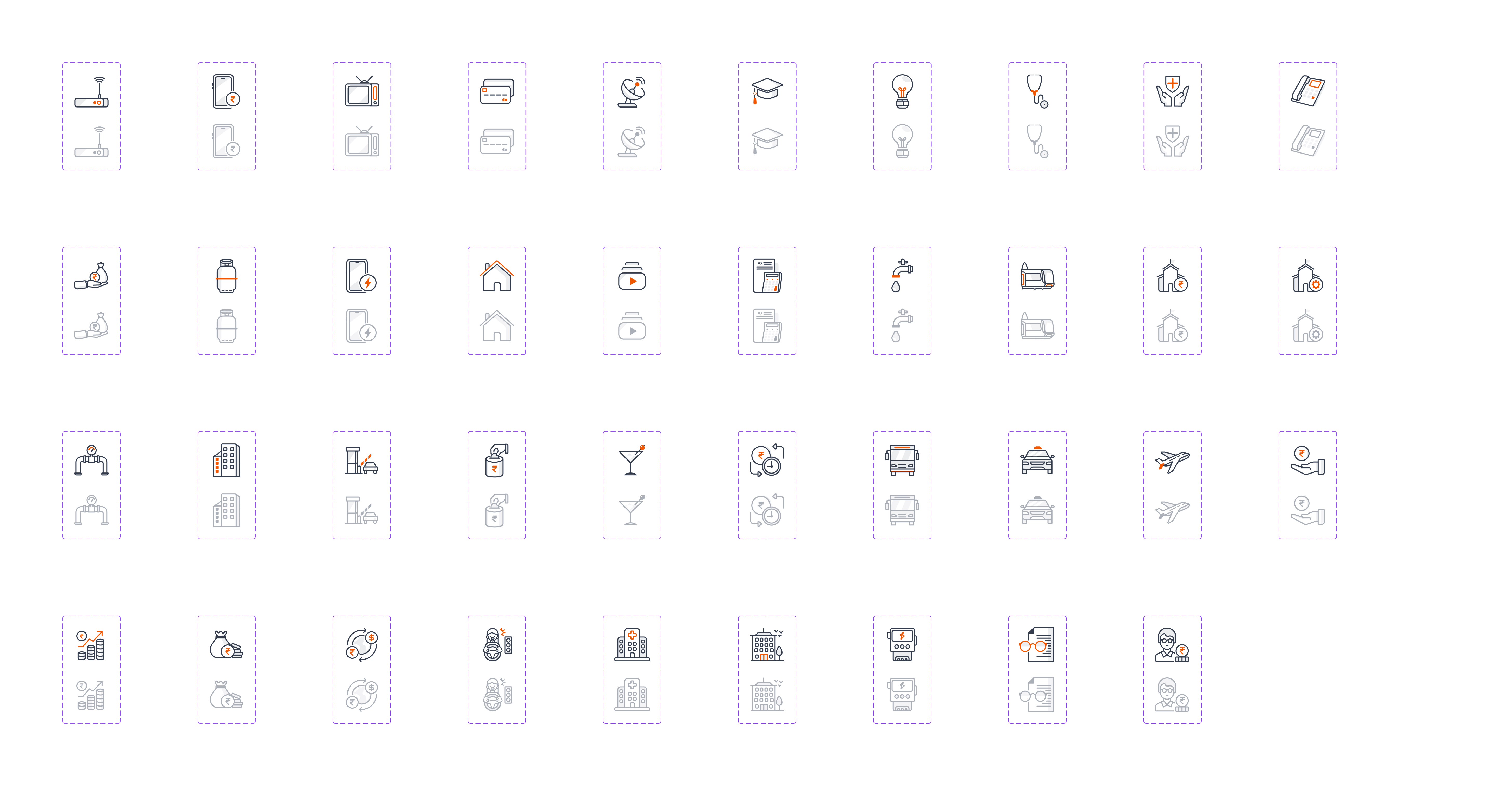
The biller list needed a visual vocabulary, so the work didn't stop at screens. It produced a reusable set of micro-illustrations contributed to the payments fintech design system. One coherent line style across every biller category, drawn on a shared grid, with active and inactive states baked in.
One family, every category.
Electricity, water, broadband, gas, education, health, insurance, housing, travel, hotels, subscriptions: each biller category gets a mark in the same weight, corner, and detail level, so the list reads as one system rather than a pile of clip-art. Each is drawn inside a consistent artboard for predictable sizing.
 Click to zoom
Two states, built in.
Each mark ships in two states (an active version with the brand orange accent, and a muted grey for inactive or unavailable categories) so the list can show what's selectable at a glance without extra UI. That's what makes them design-system components, not just drawings.
 Click to zoom
The calls behind the lift.
Illustrations as wayfinding, not decoration
The category marks aren't ornament. They're how the eye finds electricity vs broadband vs gas in a long list. Designing them as a consistent family makes the list scannable; contributing them to the DLS makes that scannability reusable everywhere.
A sample bill beats instructions
The most common add-biller failure is entering the wrong number. Showing a labelled sample bill (pointing at the exact field) does more than a paragraph of help text, so the fix is shown, not told.
Enhance, don't disrupt
With 30–50 partner organizations live, the redesign had to slot into the existing flow and information model. The lift is in clarity, consistency, and the illustration layer, not a teardown that every client would have to re-integrate.
Use the empty space to cross-sell
The picker and recharge screens had room beside the task. Filling it with contextual partner offers (ATM network, savings, loans, forex) turns dead space into value for the enterprise, without crowding the thing the customer came to do.
What it adds up to.
An experience lift to a portal already at scale, plus a reusable illustration system that outlives this one project.
- An enhancement for a portal at scale: refreshed bill-pay, recharge, and FX journeys for a platform live across 30–50 partner organizations.
- A micro-illustration set contributed to the DLS: ~40 biller-category marks, one line style, with active / inactive states.
- Reusable, not one-off: the illustrations and patterns are design-system assets any payments fintech product can pick up.
- Built to drop in: clarity and consistency raised without forcing 30–50 clients through a re-integration.
Where it goes next.
Extend the set
Grow the illustration family as new biller categories and services come onto the portal.
Bring them alive
Add subtle micro-animation to the marks for empty, loading, and success states.
Across the clients
Stage the enhanced experience and illustration layer out to all partner organizations.
One honest learning.
The highest-leverage thing wasn't a screen. It was the illustration set. Polishing individual pages helps one portal; contributing a coherent, stateful illustration family to the design system raises every product that touches a biller list. When you're working at the scale of 30–50 partner organizations, the system-level contribution is the one that compounds.