Every component in the system, in one place.
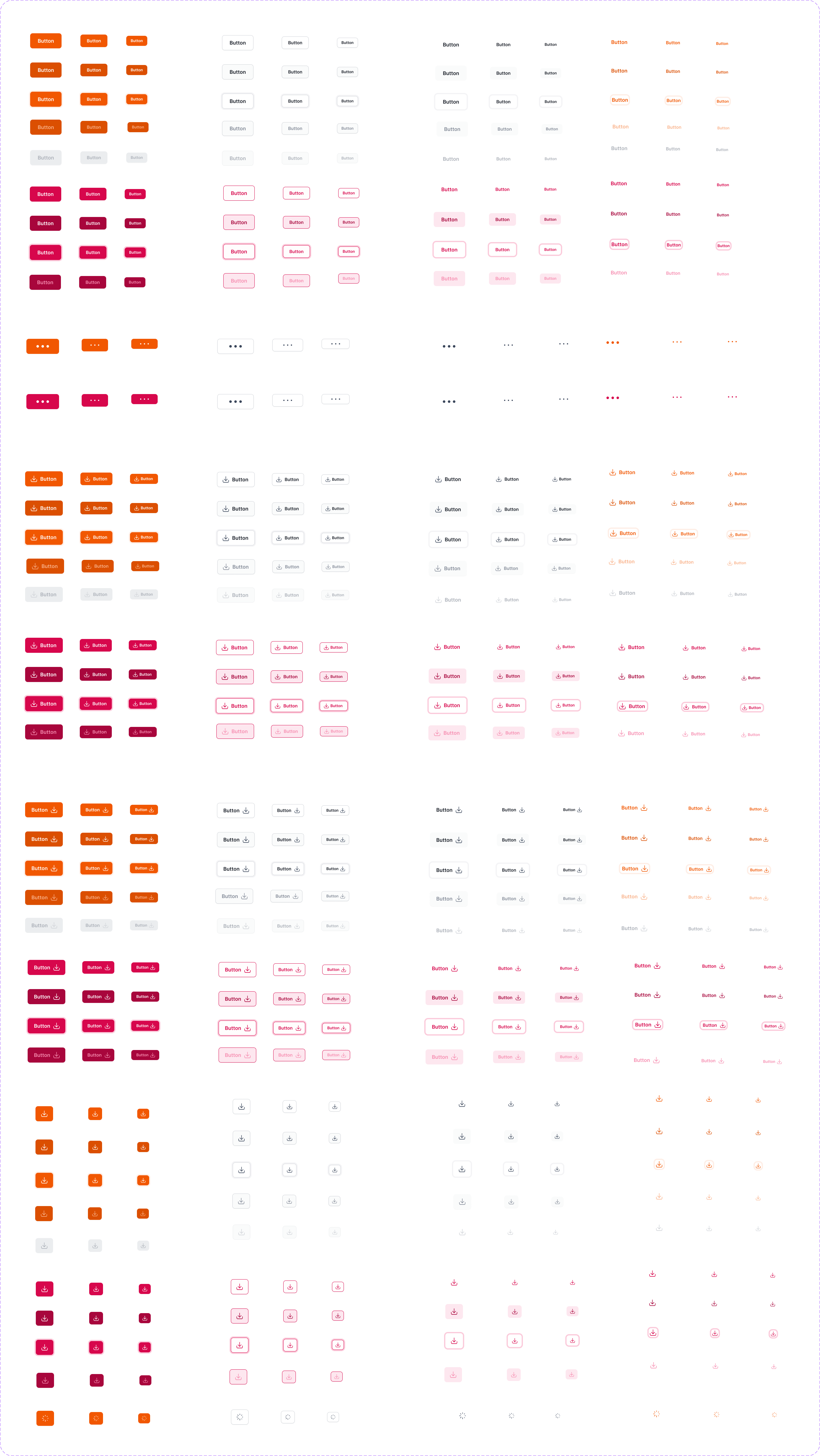
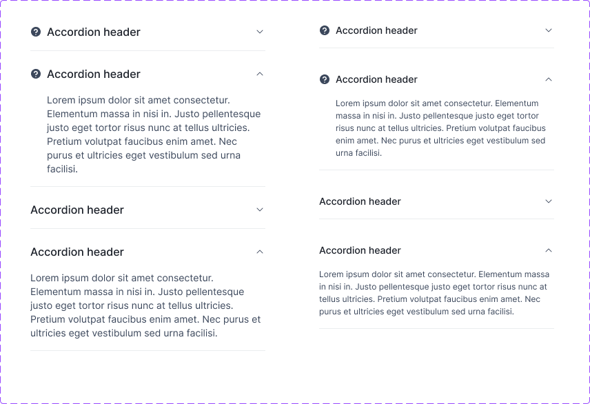
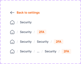
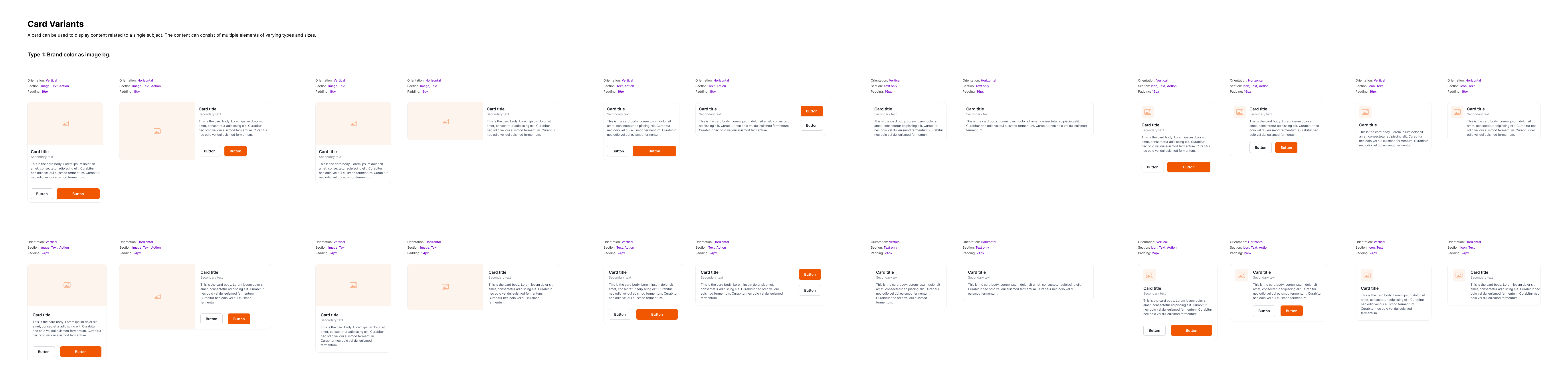
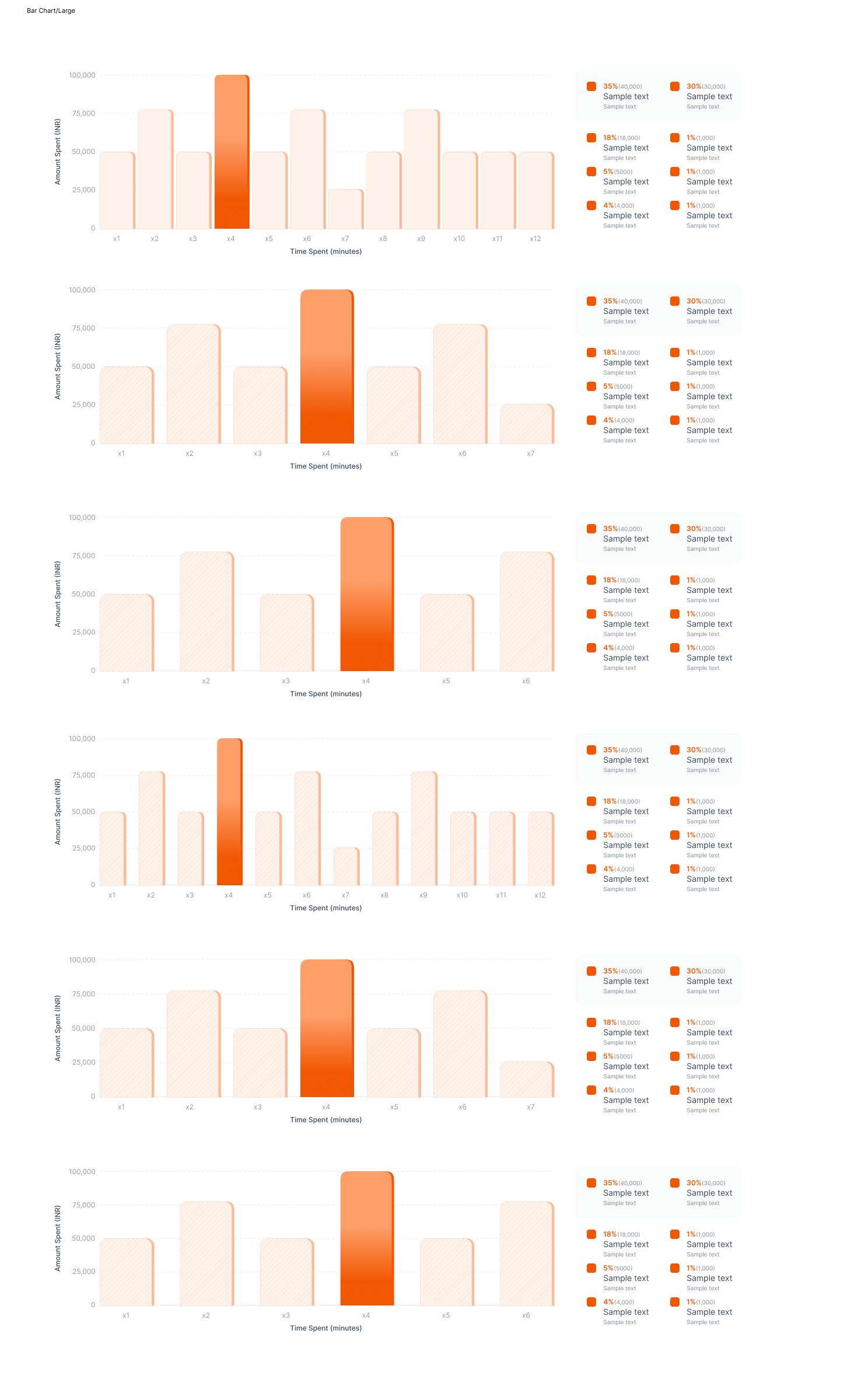
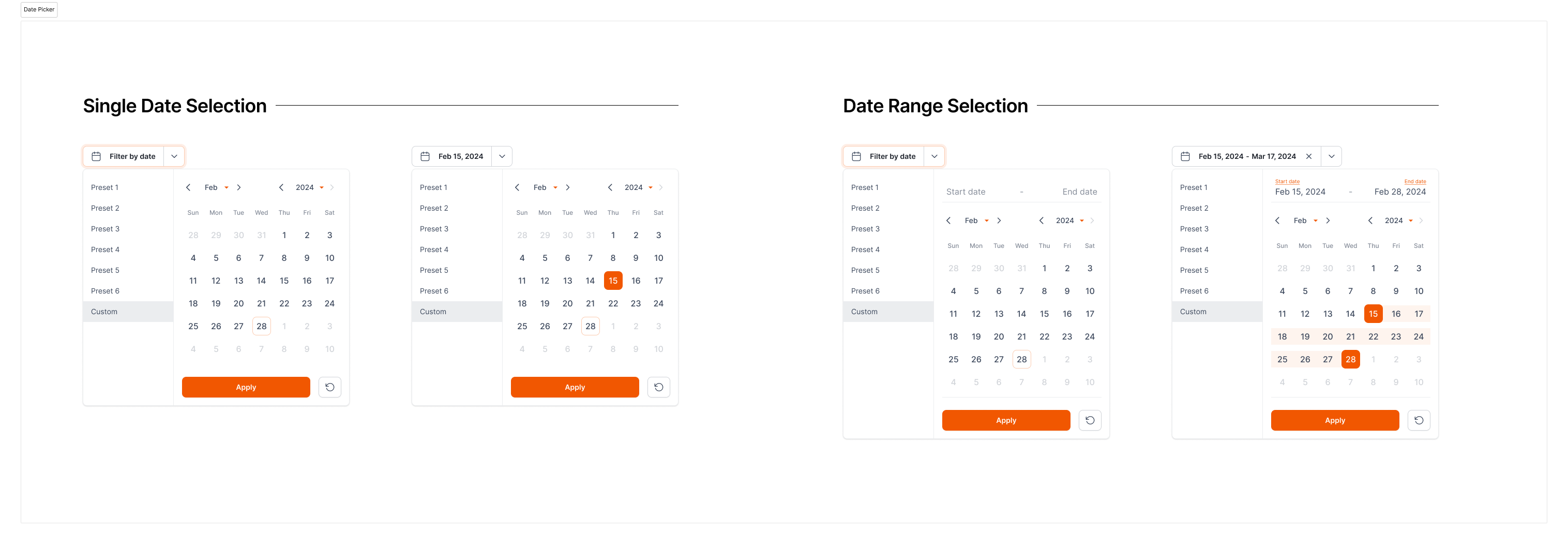
A working catalog of the payments fintech's design language system component library, pulled directly from the live Figma file, one page at a time. Screenshots and specs, not the full 300+ variant grid.
Component catalog

How a component gets built
Inside the design systemEvery component in the system is built the same way, so a Button and a Card behave like they came from the same family instead of two different designers' habits.
Start from tokens, not values
Colour, spacing, radius, and type all come from the same shared token set. A component never hand-picks a one-off value when a token already exists for it.
Every state, every size, by default
Default, hover, focus, disabled, and error states ship with the component from day one, along with its full size scale, instead of being added later per product team as they're needed.
Built from smaller shared parts
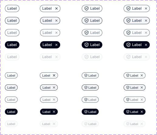
Heavier components like Cards and Chips are assembled from the same primitives (icons, avatars, buttons) rather than redrawn from scratch, so a fix to a primitive fixes every component built on it.
What keeps it consistent
Decisions behind the systemOne token set backs every surface
A button's corner radius and a card's corner radius come from the same radius scale, not values picked separately for each component. When the scale changes, every component that references it updates together, so nothing quietly drifts out of alignment.
Names describe role, not appearance
Variants are named for what they do, primary, secondary, destructive, rather than what they currently look like, orange button, grey button. A name that describes appearance breaks the moment the colour changes; a name that describes role doesn't.
Accessibility is built in, not bolted on
Focus rings, colour contrast, and minimum hit-target sizing live in the base component definition. No product team has to remember to add them, because there's no version of the component that ships without them.
- Specs live with the component, not in a separate doc. Sizing, spacing, and state rules sit on the same Figma page as the component itself, so the spec can't drift out of sync with what's actually shipped.
- New states start at the definition, never at the usage. A new state or variant is added to the component and its tokens first, then rolled out to the products using it, never patched in ad hoc on one screen.
- Deprecated patterns are marked, not deleted. Older variants stay visible and flagged instead of disappearing outright, so existing screens that still reference them don't silently break.
What it changes for a project
Why maintain a system at allA maintained component library isn't overhead sitting outside project work: it's what made wireframe-to-visual-design faster and more consistent on the product case studies this catalog backs.
- Wireframe to VD is assembly, not redesign. Because every button, card, and form field already exists as a finished, tokenised component, moving from a low-fidelity wireframe to production-ready visual design means placing real components instead of designing each pattern from scratch on every screen.
- The same components hold up across very different products. A dashboard, a payment flow, and a mobile onboarding screen can all pull from the same catalog and still feel like one system, because the components carry their consistency with them wherever they're used.
- Fixes and updates land once, not per project. A correction to a component's spacing or a new accessible state is made at the system level and inherited everywhere the component is already in use, instead of being patched into each project separately.
- Design time shifts to the actual problem. Less time goes into re-deciding how a familiar pattern should look, freeing that time for the parts of a project that are genuinely new.