Every card subscription, in one place.
A ground-up revamp of Recurring Payments Hub: a payments fintech's platform that lets cardholders see, modify, and cancel every recurring payment set on their card from a single dashboard, across 50+ partner organizations.
What is Recurring Payments Hub?
Recurring Payments Hub (the Recurring Payments Hub) is a payments fintech's platform for managing recurring card payments. Standing instructions (SIs) are the e-mandates that let merchants, such as subscriptions, utilities, insurance, and SIPs, automatically debit a customer's card on a schedule.
Built on the RBI e-mandate framework and rolled out with Visa, Recurring Payments Hub gives cardholders a single, secure dashboard to view every mandate set on their card, modify its amount or end date, and cancel it, with max-amount limits and OTP authentication baked in. Because the payments fintech powers payments for 50+ partner organizations, the same product is delivered under each client's brand.
A product built for control. Users couldn't control it.
Recurring Payments Hub's entire promise is letting people stop unwanted recurring charges. In practice, the experience was so confusing and broken that users couldn't act on the one thing they came to do.
Cardholders arrived to cancel a subscription and hit a wall: a dense table of cryptic IDs and unrecognisable merchant names, with no way to tell what was even charging them. The one button that mattered (Cancel) was buried in a row, and frequently led nowhere.
The fallout showed up in the open: users reporting they paid the ₹2 card-verification fee and were then locked out, login failing on repeat, cancellations that wouldn't go through, and money still being debited for things they'd tried to stop. A platform meant to give control had quietly eroded trust instead.
The core question
How might we make stopping an unwanted charge genuinely effortless, so any cardholder can see exactly what's debiting their card and cancel it in a tap, with trust at every step?
What the revamp had to achieve.
Give users control
Make seeing, editing, and cancelling any card mandate effortless, all from one place.
Reduce friction
Cut the onboarding and management effort so users complete actions instead of abandoning.
Modernise information design
Replace dense tables with a scannable, mobile-first, action-oriented interface.
Feel native to every partner organization
Restore continuity and scale it: one themeable system across 50+ partner organizations, no bespoke rebuilds.
How we approached it.
Audit
Mapped the legacy flow end-to-end and pinpointed where continuity broke.
Define
Framed the drop-off problem and set goals around continuity & friction.
Design
Rebuilt onboarding, dashboard, and mandate actions mobile-first.
Systemise
Turned the UI into a themeable token-driven design system.
Handoff
Shipped per-partner theming as a clean developer artifact.
The legacy flow.
A client-branded header sat on top of a dated enterprise portal, with a third visual language appearing mid-flow.
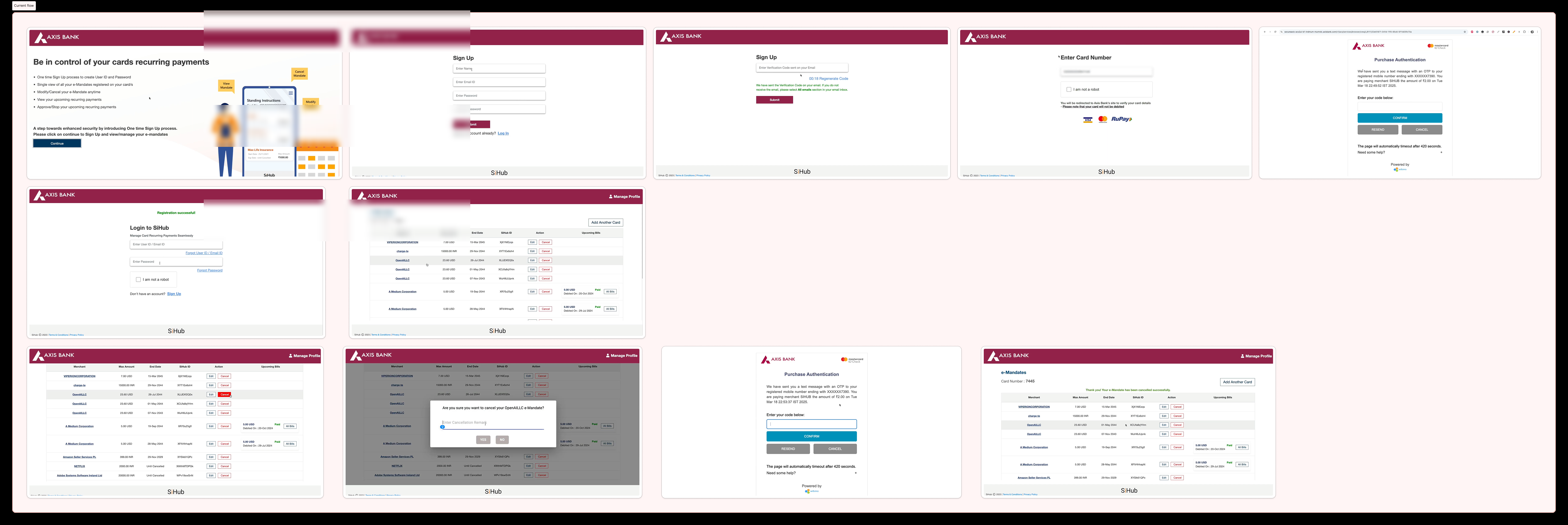
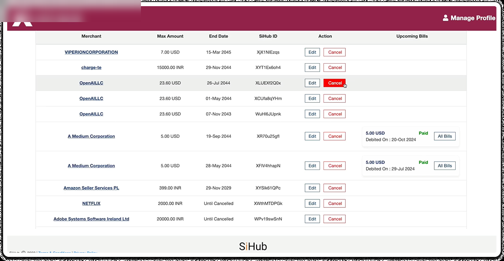
You couldn't tell what was charging you
Cryptic IDs (XjX1NlEzqs) and raw merchant strings, no logos. Users couldn't identify their own subscriptions, let alone decide what to cancel.
Cancel led nowhere
The one action that mattered was a tiny button in a dense row; it frequently failed to open or complete.
Locked out after paying ₹2
Users reported login loops and being unable to get in after the card-verification fee: blocked before they could even start.
Backend feel, no continuity
Mixed currencies, absurd end dates, raw IDs, and an off-brand portal handed off mid-flow. It read like an internal tool, not your financial institution.
The revamp.
A mobile-first, card-based product with one consistent system end-to-end: clearer actions, calmer hierarchy, and confirmations that explain consequences.
The turning point: from cryptic table to clear control
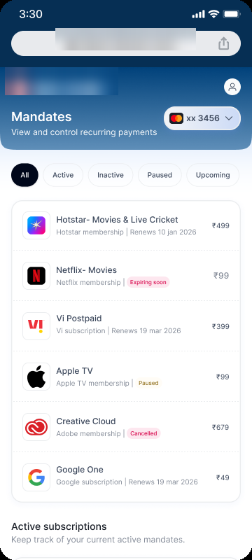
The same data, reimagined. Where users once saw unreadable IDs and a buried button, they now see a recognisable subscription list (logos, statuses, and one-tap actions).
Cryptic IDs, raw merchant strings, mixed currencies, a buried Cancel, and no real mobile view.
 Click to zoom
 Click to zoom
The same data on both surfaces: merchant logos, clear status badges, filter tabs, one-tap actions.
Every mandate, fully transparent
Tapping a subscription opens everything a user needs to decide: renewal dates, amount and frequency, full transaction history with paid/failed states, and the two actions that matter, Cancel and Modify, front and centre.
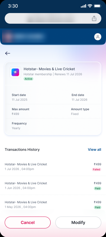
Renewal, amount, frequency, transaction history: Cancel & Modify in reach.
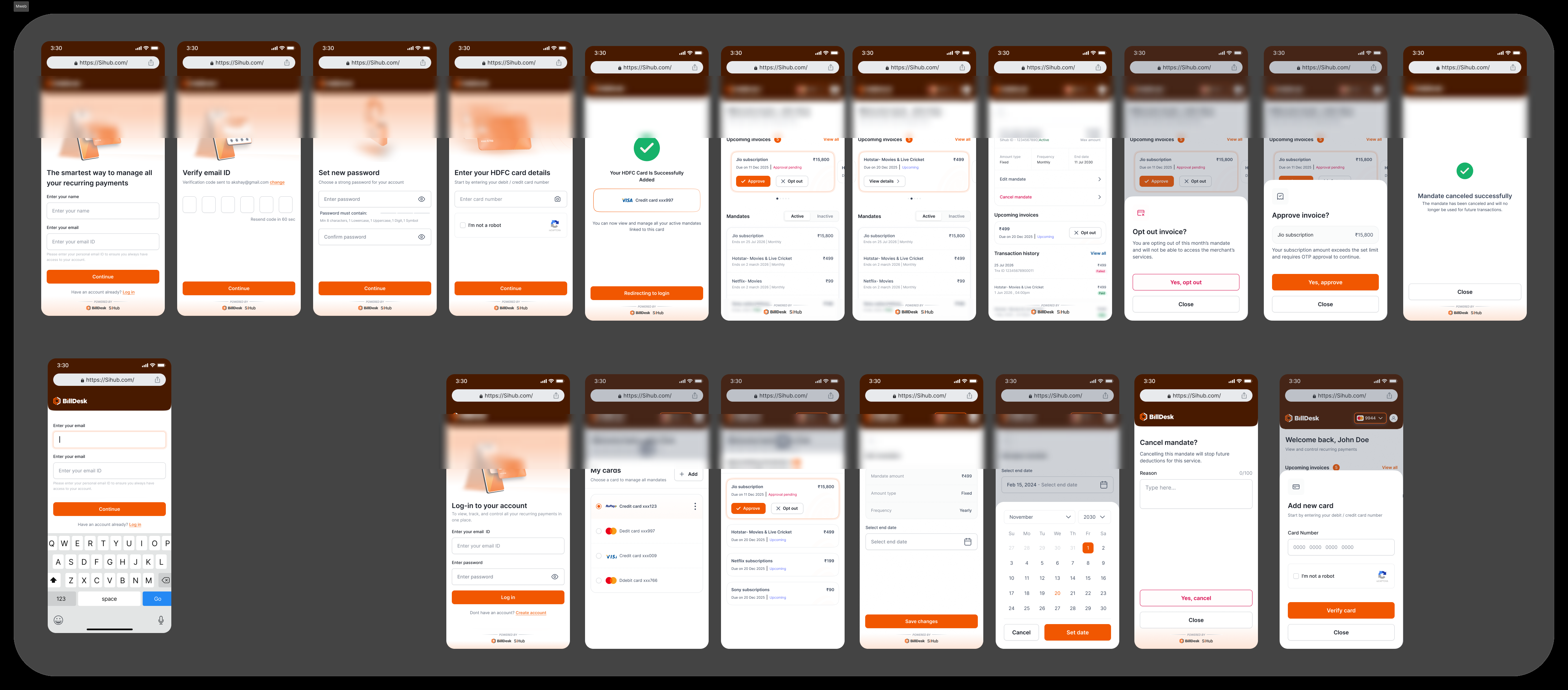 Click to zoom
Onboarding → dashboard → manage → confirm, end to end. Click to see the full board.
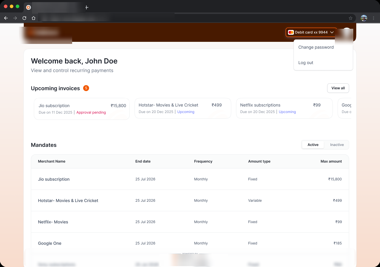
The same control center on desktop
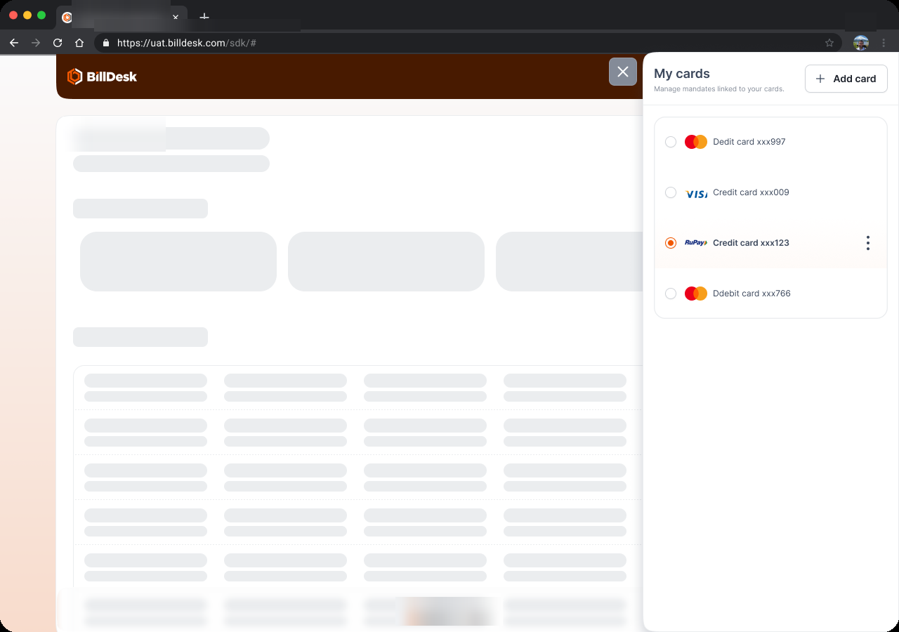
On larger screens the dashboard opens up, with upcoming invoices as a carousel, a clean mandates table with real merchant names, and per-card switching. The legacy table done right: spacious, legible, and human-readable.
Click to zoom
 Click to zoom
Key design decisions
A single control center for every mandate
The dashboard leads with upcoming invoices and all active mandates in one card-based view, with Active / Inactive tabs and inline approve / opt-out. Why it matters: this is the whole point of Recurring Payments Hub. Users see everything debiting their card and act on it without hunting across merchant sites.
Card-based layout over dense data tables
Replaced the wide e-mandates table with scannable cards that surface amount, frequency, and next charge. Why it matters: it works on mobile and puts the next action in reach instead of burying it in a row.
Confirmations that explain consequences
Cancel, edit, and opt-out use bottom sheets that state the outcome ("stops future deductions") with clear success states, backed by OTP and max-amount limits. Why it matters: control only feels safe when users understand exactly what an action does.
One consistent, client-native system
A single component system runs from onboarding to confirmation and is themed per partner. Why it matters: it removes the "handed off to a stranger" feeling that broke trust, and scales to every partner organization.
Before → After at a glance
| Before | After |
|---|---|
| Client header on a dated portal; off-brand body | One consistent component system, themeable per partner |
| A third visual language on OTP / auth screens | Unbroken visual continuity from start to finish |
| Dense, wide tables (not responsive) | Card-based dashboard with Active / Inactive tabs |
| Long friction signup, single-field code | Streamlined steps, clear OTP entry, big primary actions |
| Backend feel: raw IDs, timeout warnings | Consumer feel: "Welcome back", clear success states |
| Edit / Cancel only | Approve, opt-out, edit amount & frequency, multi-card |
One control center, 50+ partner organizations: partner themes.
Recurring Payments Hub has to feel native inside every partner organization. Rather than rebuild the experience 50+ times, the redesigned UI was made themeable, so the same control center wears each client's identity.
Generated from a brand colour
A partner theme starts from one input: the client's primary HEX, its action colour (CTAs, primary buttons, focus rings). A deterministic engine expands it into 20 UI tokens (eight tints mixed toward white, two shades mixed toward black) that drive every fill, border, icon, text and illustration colour in the product.
See it on a real recurring-payments screen
Pick a partner. The recurring-payments screen below re-skins itself from that partner's generated tokens, the same tokens dev receives. Buttons, badges and focus rings come from the primary; the top bar comes from the accent (or a dark shade of the primary when there's no accent).
When the brand has two colours: primary + accent
Partner organizations rarely use one colour. Many run a different colour in the layout than the one on their buttons, a navy top bar with an orange CTA, say. So the engine takes an optional second input: an accent HEX. The split keeps both honest: action surfaces always derive from the primary, while the brand-coupled tokens, top status bars (layout-brand), illustration fills (illustration-normal-c1), micro-illustration accents, derive from the accent. One colour drives what you tap; the other drives what the client looks like.
What you tap
fill-action, fill-action-pressed, text-action, border-brand-focus-ring: every interactive surface. Always the primary, never the accent.
What the client looks like
layout-brand (dark top bars), layout-brand-light, microIllustration-accent, illustration-normal-c1 (the layout and artwork). Falls back to a shade of the primary when no accent is given.
Worked example: Partner B
Primary #FF9C00 (orange CTA) + accent #0048B8 (navy wordmark & layout). Buttons come out orange; the top bar and illustration come out navy. Without the accent split, the whole theme would have gone orange, and stopped looking like Partner B.
An AI skill does the heavy lifting
The whole procedure is packaged as a Claude Code skill. Hand it a client's primary colour, logo, and reference screenshots, and the agent runs the pipeline end to end: no manual recolouring.
One primary + logo
The partner's HEX, logo SVG, and brand references.
Generate tokens
Primary → 20 deterministic tokens, byte-identical to spec.
Assets
Illustrations recoloured, white logo mark for dark surfaces.
Per-partner package
A clean .txt token file + themed assets for devs.
From hours to one command
What used to be slow, error-prone manual recolouring per partner is now a single run, and because the math is deterministic, every partner comes out exactly to spec. That's what makes 50+ themes maintainable.
Customised to each partner's needs
The skill handles the mechanical 90%. Design judgment goes into the exceptions: the parts a partner's brand or product team needs handled by hand.
Dark-surface marks
When a client gives no dark logo, the engine generates a white knockout mark so it stays legible on the dark brand bar.
Brand-coupled recolour
Five brand-linked colours in each illustration are re-mixed against the partner's accent (or primary) at fixed ratios, so artwork matches without redrawing.
Contrast safeguards
When a brand colour fails contrast on white or dark, the theme is adjusted so text and actions stay readable.
Partner-specific screens
Some partners need a custom flow or screen beyond the standard set, built on the same system, themed to match.
What design moved.
- Control, consolidated: every card mandate is now visible and manageable from one dashboard.
- Friction removed: streamlined onboarding and a card-based view that works on mobile.
- Trust restored: a client-native, consistent experience replaced the off-brand handoff that drove drop-off.
- Scale unlocked: one themeable system across 50+ partner organizations instead of per-partner rebuilds.
Hub+: every mandate, every channel.
Recurring Payments Hub solved card mandates. Hub+ extends that same control beyond cards, to UPI autopay and eNACH, so a single hub manages every standing instruction a user has, whatever the payment method.
Card
The recurring card mandates Recurring Payments Hub already manages today.
UPI autopay
Recurring UPI mandates, brought into the same control center.
eNACH
Account-based standing instructions, unified alongside the rest.
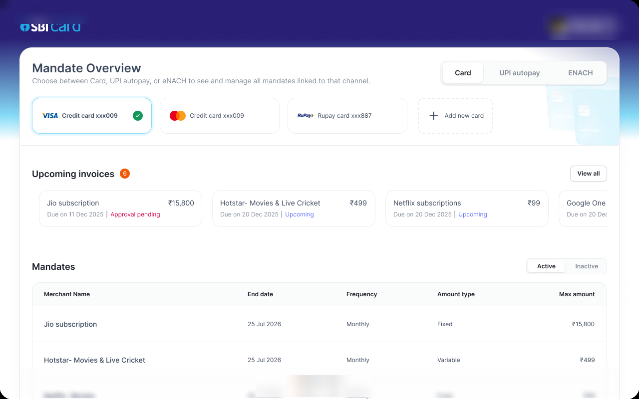 Click to zoom
A "Mandate Overview" with Card / UPI autopay / eNACH tabs, so every standing instruction lives in one hub regardless of channel.
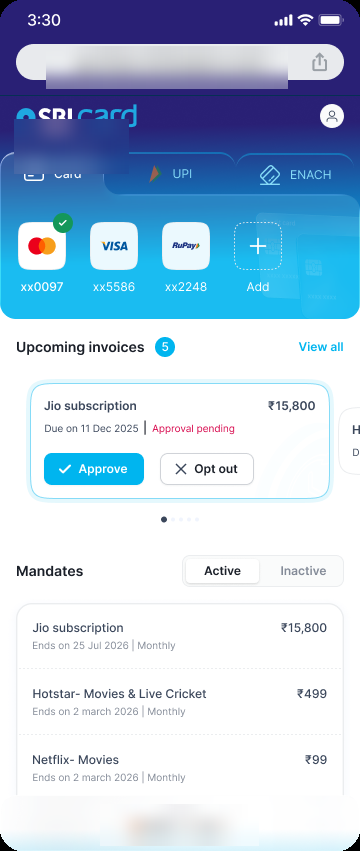 Click to zoom
On mobile, Card / UPI / eNACH tabs sit at the top: same control center, every payment method.
Today a user's recurring payments are split across cards, UPI, and account-based NACH, each with its own portal. Hub+ folds all three into a single hub.
It's the natural extension of the same insight that drove the revamp: real control means seeing everything in one place, now across every channel, not just cards.
What I'd take forward.
Recurring Payments Hub's value is control. But control only works if users can find it and trust it. The win wasn't a prettier screen; it was turning a scattered, off-brand portal into one clear control center that feels native to every enterprise it lives in.