Bonds, made legible enough to actually buy.
Wealth is a fixed-income investing app: browse bonds, place an order, hold a portfolio. The design problem was not the transaction. It was that a bond hides behind yield to maturity, credit ratings and security cover, and a first-time buyer cannot see what they are actually being promised.
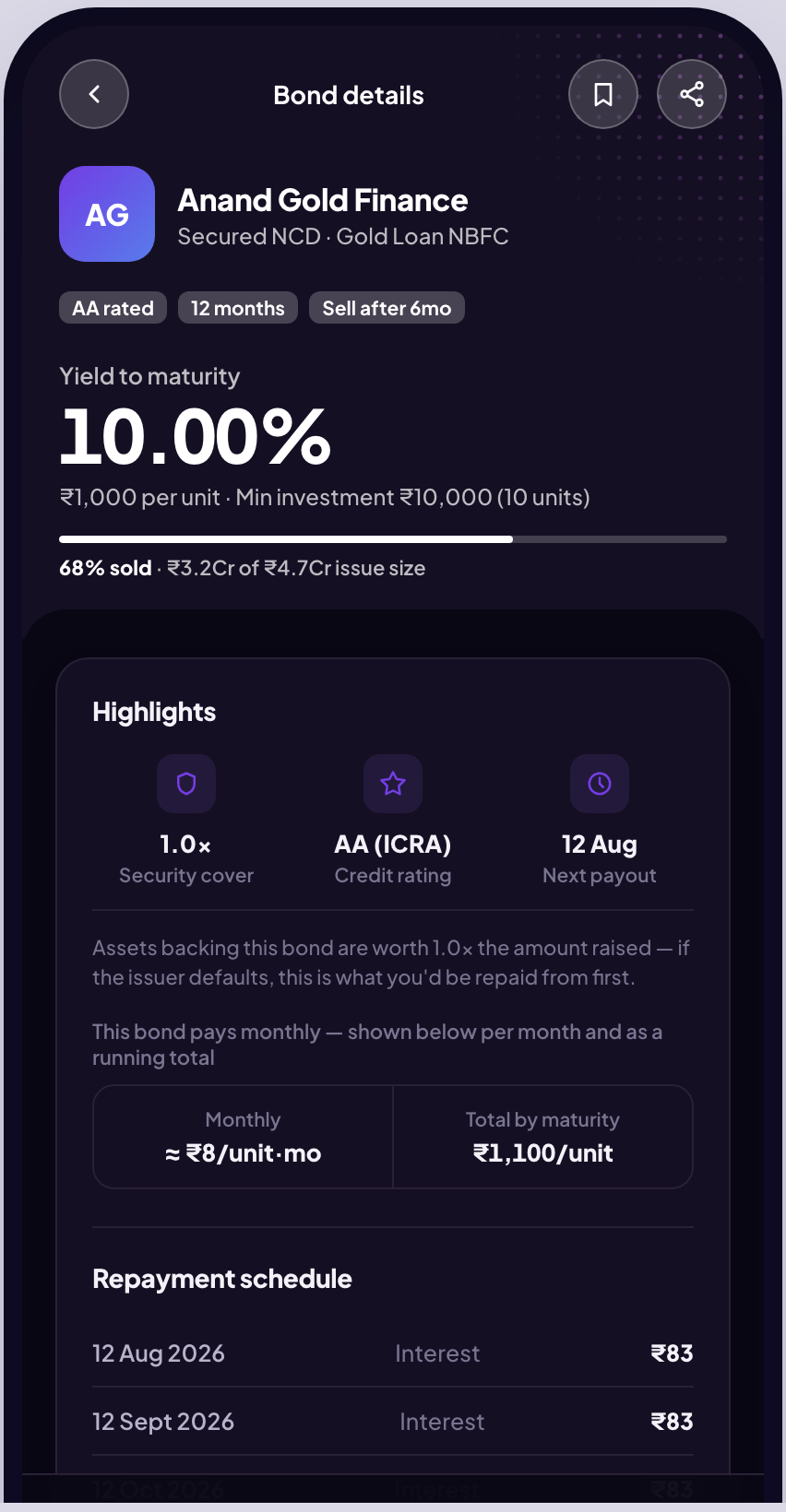
A fixed-income product for people who have only ever held equity.
Wealth is a new product line the company is taking to pitch. I designed it end to end: Aadhaar and PAN onboarding, bond discovery and filtering, the order and OTP flow, a portfolio with holdings and tax certificates, recurring SIPs, referrals, and a Learn section. The whole thing exists as a working click-through prototype rather than a slide deck, because the argument for it is easier to feel than to describe.
A bond is a promise you cannot see.
Indian retail investors are moving into fixed income, but the instrument is opaque in a way equity is not. A stock has a price. A bond has yield to maturity, coupon frequency, credit rating, security cover, and a maturity date, and none of those answer the only question a first-time buyer actually has: what do I get, and when?
The vocabulary is the barrier
YTM, coupon, security cover and AAA-to-D ratings all have to be understood before the first purchase makes sense. Most apps show the numbers and assume the rest.
Risk is stated, not shown
A rating letter is not a feeling. Nothing tells a buyer what happens if the issuer misses a payment, or what the security cover would actually cover.
What the product had to do.
Show the payout, not the jargon
Lead with money and dates. The technical terms stay available, but they are not the thing a buyer has to decode first.
Put risk beside comfort
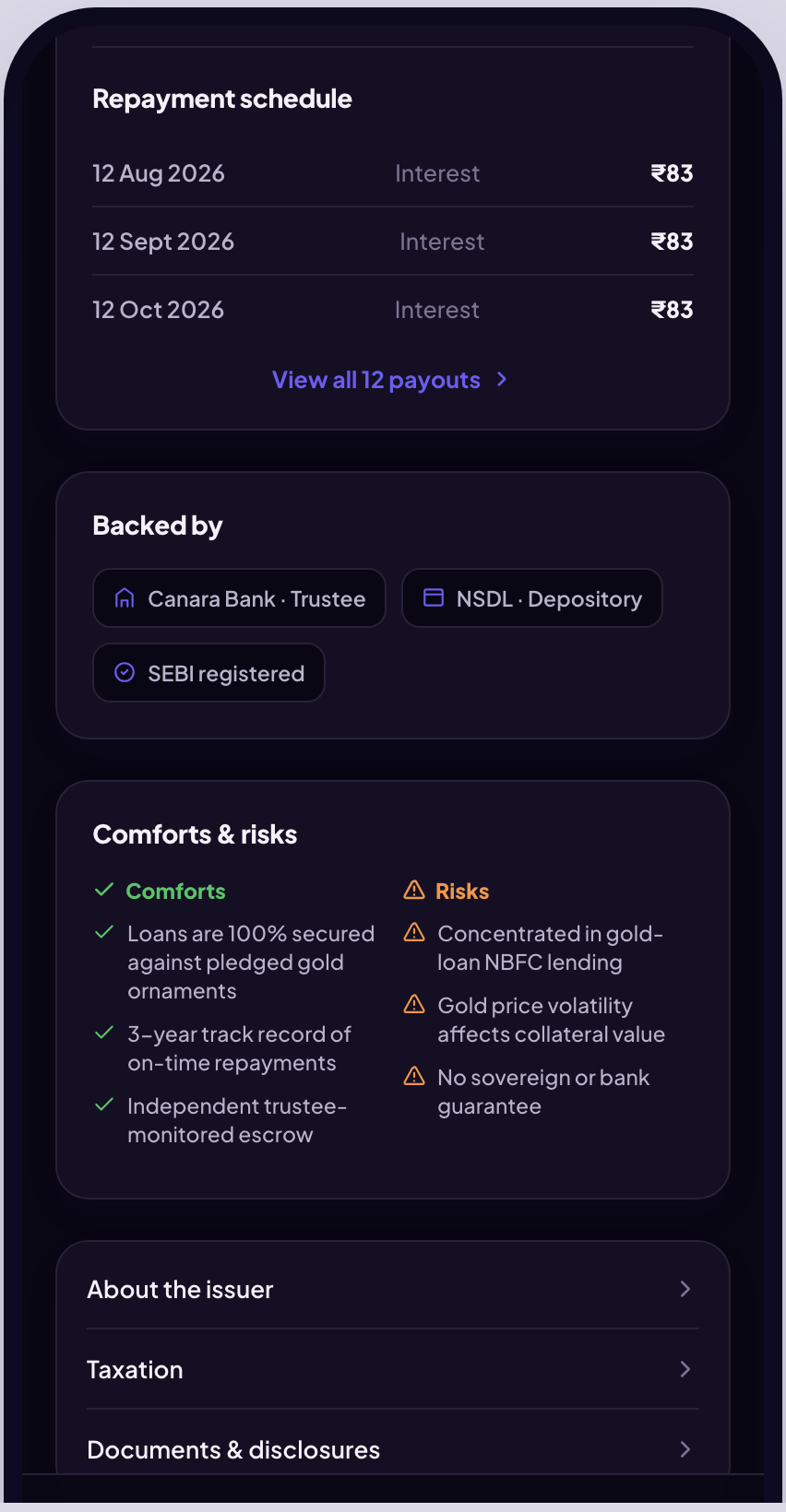
Rating and security cover belong on the same screen as the return, so the trade-off is read in one glance instead of two.
Teach inside the flow
Education sits in the product rather than in a help centre, reachable at the moment the question comes up.
Prototype first, argue later.
This is a pitch for a product that does not exist yet, so the fastest way to test the idea was to build something people could hold. I designed the flows, then built them as a working click-through so the pitch could be walked rather than narrated.
Map the instrument
What a bond actually promises, and which of those facts a buyer needs before committing money.
Design the detail screen first
The hardest screen sets the vocabulary for the rest. Everything else was designed outward from it.
Build it click-through
20+ linked screens covering the full path, so the pitch is a demo instead of a description.
The repayment schedule, laid out payout by payout.
The bond detail screen answers "what do I get, and when" before it says anything technical. Each scheduled payout is listed with its date and amount, so a buyer reads a series of dated payments rather than a percentage they have to model in their head. Rating and security cover sit on the same screen, directly against the return, so the comfort and the risk are weighed together.
Everything either side of the buy.
Onboarding runs Aadhaar, PAN and a selfie check. Discovery filters by rating, yield and maturity. The order flow confirms with OTP. The portfolio carries holdings, maturity dates and tax certificates, and SIPs turn a one-off purchase into a recurring position. A Learn section explains ratings, security cover, taxation and laddering, written for someone buying their first bond rather than for someone who already knows.
KYC without the dead ends
Aadhaar, PAN and selfie verification, with the wait states written honestly rather than hidden behind a spinner.
Filters that match the question
Rating, yield and maturity, because those are the three axes a buyer actually chooses along.
Holdings and paperwork together
Positions, maturity dates and tax certificates in one place, so the annual filing is not a separate hunt.
Education in the product
Ratings, security cover, taxation and laddering, explained where the question arises instead of in a help centre.
An ongoing pitch, not a shipped product.
Wealth is a new product line still being pitched. Nothing here has shipped, so there are no engagement or conversion numbers to report, and I would rather say that plainly than dress a prototype as a launch. What it has done is make the proposition concrete enough to argue about: the conversation moved from whether retail fixed income is worth building to which instruments to open with.
The pitch is walkable
A working click-through answers "what would it feel like" in the room, which a deck cannot.
The hard problem surfaced early
Every review converged on legibility of the instrument rather than on the transaction flow, which is where the design effort then went.
What I would push on next.
The detail screen works for a single bond, but not yet for comparison, and comparison is how people actually decide. A side-by-side that holds two repayment schedules against each other is the obvious next move. The Learn section also needs testing with real first-time buyers rather than with colleagues who already know what a coupon is, and that is the gap I would close before this went anywhere near a build.